ABS-CBN Foundation
A donation website redesign for the non-profit arm of Filipino media giant ABS-CBN. Designed to be socially impactful with clemency and urgency at heart.
Role:
UX Direction: coordinated 5-day design sprint, user research, and visual design
Project Management: as an individual contributor, I took on scrum master responsibilities
Problem:
ABS-CBN had a traditional, on-ground approach to collecting donations that were yielding very low returns for the NPO.
Solution:
Boost digital awareness, craft online onboarding, engagement & retention strategy to increase donations and help Filipino causes in the Philippines and all around the globe.
Results:
Increased online donations by 25% from Aug 2017 to Jan 2018

Crafting a seamless international online donation process for a global conglomerate
In August 2017, ABS-CBN amplified their mission to avail of the massive market reach of their flagship The Filipino Channel (TFC) and the benevolent hearts of Filipinos everywhere who always find a need to send back help to their families in the Philippines.
As leader and part of the founding UX team, I established a small and agile product team to redesign and relaunch AFI’s website so that it would be responsive, usable, scalable and cater its public service to different regions, as well as boost its social media presence and community outreach.
The process kicked off with discovery and a discussion of goals, our vision for the product, and user experience
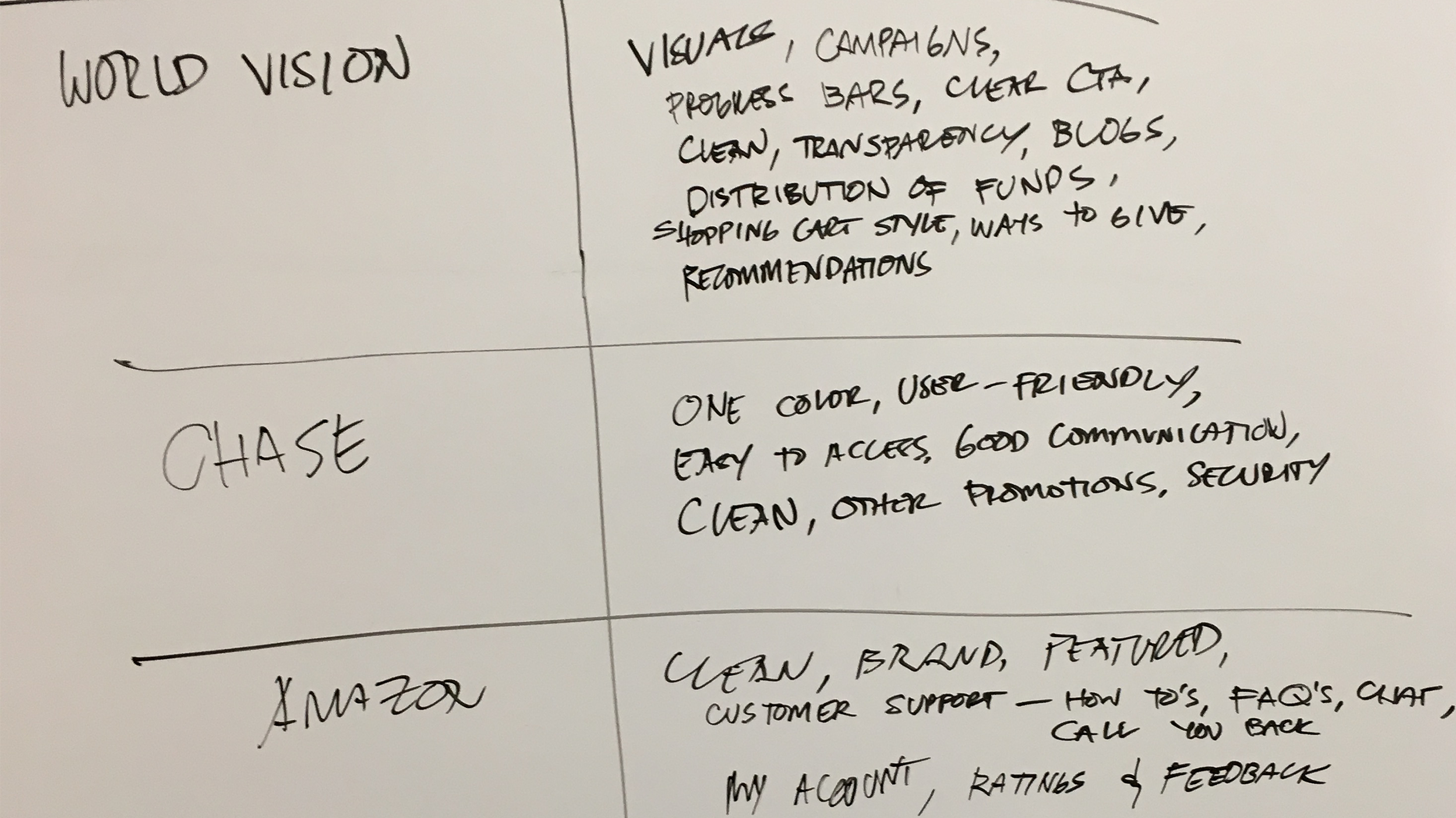
The team discussed the vision of the product and the business, and distilled this down into features and functionality. In the beginning stages, we listened to timeboxed lightning talks by speakers who simulated the perspectives of the business, the users, competitors, technical opportunities, and the NPO industry itself. As we listened to the lightning talks, we captured our ideas on post-it notes in the form of ‘How Might We’ questions that we’d later aggregate via an affinity mapping exercise.


We simulated online donation scenarios while folding key collaborative learnings into our design process.
In order to focus the product team and the stakeholders on a viable problem-solution fit (and to REALLY get the cross-functional teams involved), the team voted on the top HMW’s and synthesized them through a variety of divergent and convergent hands-on exercises including user journeys, sharing lightning demos, a sketching session (and the opportunity to present each participant’s sketch in an ‘art museum’). Finally, these creative, hands-on collaborative sessions resulted in storyboards that would be the basis of our first prototype for user testing.

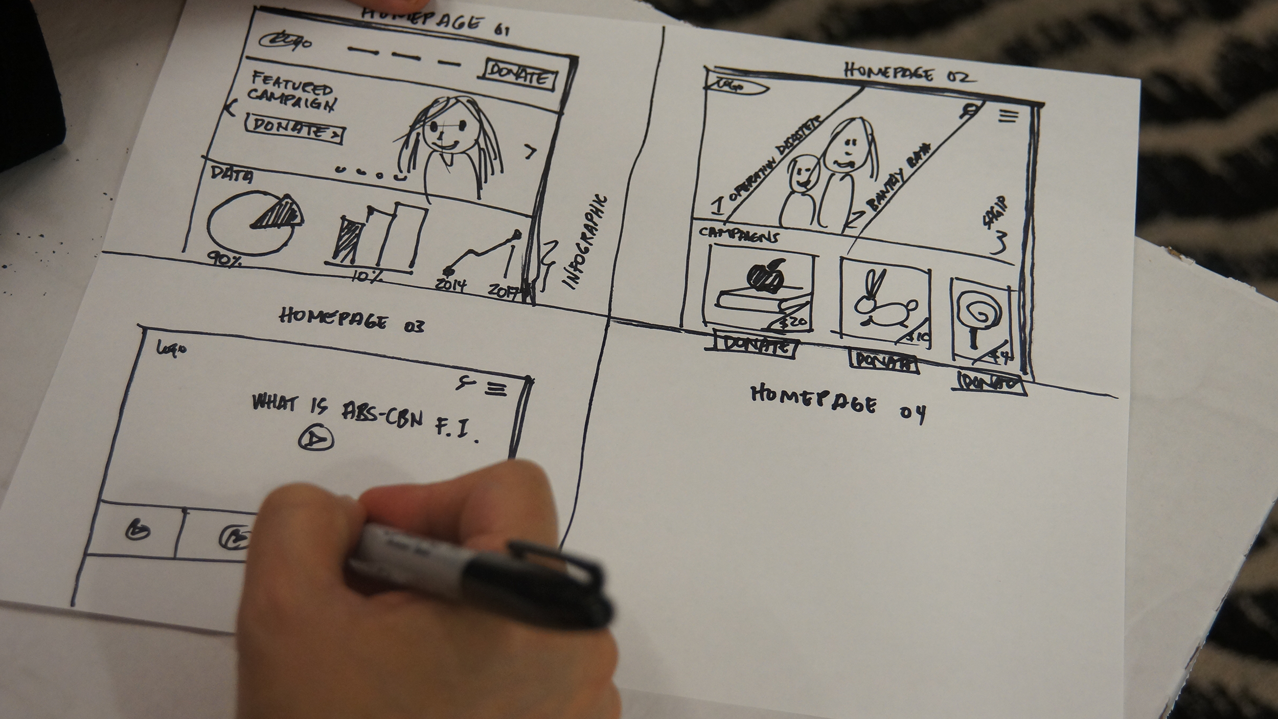


We refined the idea and moved from concept to collaborative ideation to vision, creating a real prototype of the redesign
Testing features and experience with those who matter
We invited a total of 6 users for our user test. They were recruited by my team based off of the proto-personas we had created in our discovery session. Our makeshift lab was composed of 2 rooms - the interview room and the observation room. The actual user test was conducted in the interview room where we gave the user some tasks while asking them to think aloud and asking them some follow-up questions. In the observation room, the rest of the team members were taking notes and not only listening to the words being said, but expressions and actions.


Overall, user testing validated the features that the team discovered in the first part of the sprint, such as powerful storytelling, donation progress and tracking, data about the foundation and the beneficiaries, other ways to donate, etc.
These are the features that would be the priority focus of the information architecture and wireframe design going into the scrum sprint.
Designing and building the real product and donor experience.
As confidence in our solution increased thanks to user validation, exploration gave way to a design of the full product experience and engineering. We created a working responsive donation website and over 4-6 weeks tested and eventually shipped. One significant challenge for me was creating a product experience that worked for all regions and currencies alike; a product experience that could be availed by all. I focused on clarity in interactions and symbols and designing an interface that required little to no training.

Product design example (circa November 2018)