Beachbody
Beachbody is the nation's leading health, fitness, and wellness company providing support to its millions of users via physical products, digital services, online support, live events, & more.
Role:
UX Direction: managing UX designers, coordinating content strategy, wireframes, prototypes, and user testing.
Art Direction: as an individual contributor, responsible visual design of three A/B tests.
Problem:
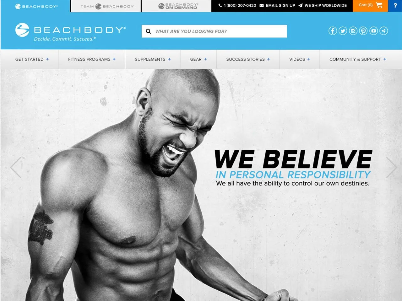
An abandonment survey, usertesting.com, and qualitative data showed high bounce rate, specifically noting that screens are cluttered with heavy copy & too many options, leaving users with decision paralysis.
Solution:
Design a cleaner UI and define a more user-friendly navigation to help increase conversions and decrease bounce rate.
Results:
Great team learnings into the A/B and multivariate testing process. Many opportunities arose from this project for further iteration and improvement to the product.

It all starts with our users…
Before embarking on a project of this scope, the UX team in a concerted effort with the product manager and dev team embarked on some quick user research exercises so that we knew exactly who we were designing for, their pain points, and so that we may propose the best possible solution in the most efficient way.
My contribution was with leading the UX team in conducting competitor analysis, existing data research sorting and filtering, and navigation and content research.
Content Strategy
With the goal of organizing the current site’s content to achieve a greater user-friendly interface, but not disrupt familiarity for returning users, the team and I conducted an open card sorting exercise with our existing customer base to further validate the existing categories, taxonomy, and relevancy of the menu navigation.
Learnings resulted in the team introducing and implementing a global navigation, allowing users to reach the three major Beachbody domains at a glance. Additionally, we added a filtering system that would allow new visitors to access a workout program best suited to their individual needs.
Wireframes / Prototype
The UX team and I collaborated in crafting wireframes, which explored the home page concepts and created an enjoyable and engaging user experience to drive sales conversion on Beachbody.com. Visual design options take cross-platform needs into account, as well as being scalable to the OTT platform.
User Testing
The team and I conducted two types of user testing - moderated, in-person usability testing and unmoderated, remote usability testing. After three days of in-person testing we collected data and applied it to the remote testing. Once the remote testing was complete, we studied the 40 hours of total user testing and extracted the essential data for pushing live and immediately began working on A/B testing.
After working on wireframes and lo-fi prototyping some solutions, I led the art direction and design of three high res comps to see which one would be the ideal navigational solution:


A/B Testing
Once we collected significant data to move forward confidently on an approach for the global navigation, I worked with the online acquisition team on a strategy for maximizing user engagement and business goals. The outcome was designing A/B testing of landing pages (different homepages) with focus on heavy e-commerce, heavy product branding, and then a hybrid version of each:
Lessons Learned
Near the end of this project is when I was recruited to another company, so results were still coming in as I was departing. However, there were many lessons learned…the main lesson being that user testing is highly important in product design. In this case, we discovered many opportunities for iteration and immediate improvements that can move the needle. Users gave great feedback such such as not wanting CTA buttons so aggressively in their face…rather at key decision points. They also told us they wanted to see short snippet clips about the workouts to encourage them to take the leap and make the purchase. They wanted more details about our before & after testimonials, which was a great opportunity for upsells. All in all, this project was a great experience to always keep our users in mind first because it will help the business’ bottom line in the long run.